
The Colors page is your single source of truth for brand color — every shade, where it belongs, and its exact value.
Where to find it: Left menu → Brand → a brand → Colors. Part of the Brand Guidelines guide.
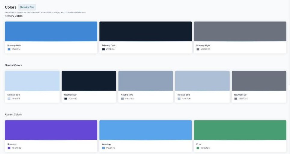
Your brand color system, laid out as swatches with hex codes, usage notes, and CSS token references.
The color groups
Colors are organized into groups so everyone uses the right shade in the right place:
- Primary — your main brand colors (Primary Main, Dark, and Light).
- Neutral — the grays for text, borders, and backgrounds (Neutral 900 down to 500).
- Accent — semantic colors like Success, Warning, and Error.
Each swatch
Every swatch shows its name, its hex code with a one-click copy button, usage tags, and accessibility (WCAG) guidance — so a designer or developer can grab the exact value and know where to use it.
What’s next
- Back to the Brand Guidelines guide.
- See Typography.
- See Icons.
- See Brand Voice.