
Analytics turns everything the module tracks into charts: revenue over time, how each agent and territory is performing, and where candidates sit in the onboarding pipeline.
Where to find it: Left menu → Sales → Team & Resources → Sales Teams → Analytics. Part of the Team Management guide.
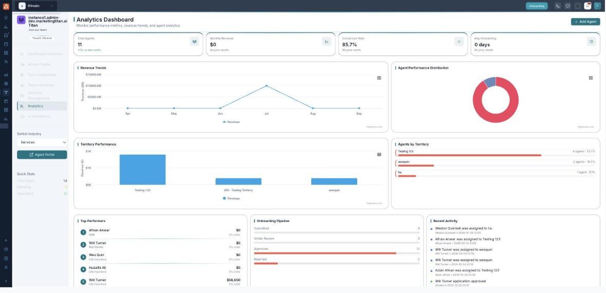
Analytics — revenue, agent and territory charts plus the onboarding pipeline.
What each chart tells you
| Chart | What it answers |
|---|---|
| Revenue | How revenue is trending over your chosen period. |
| Agent performance | Which agents are producing the most — and who needs support. |
| Territory performance | How your territories compare. |
| Onboarding pipeline | How many candidates are at each stage, from application to approved agent. |
Read the onboarding pipeline
- Open Analytics from the left menu.
- Find the pipeline chart — it counts candidates at each stage.
- A pile-up at one stage points to a bottleneck — for example many Pending means the Admin Center queue needs attention.
💡 Tip: Pair the pipeline with an AI Workflow that notifies you the moment new applications arrive, so the queue never stalls.
FAQ
Can I change the date range?
Yes — the charts respect the range and industry selected for the module.
Does Analytics cover a single territory?
You can see per-territory performance here, and manage the territories themselves in Territory Management.
Where does the revenue figure come from?
From the revenue attributed to your agents and territories — the same numbers shown on the dashboard cards.